Faster websites using WebP images
Google's WebP image format has a smaller file size compared to PNG and JPG helping your websites load faster. Learn why and how to implement it.
In this article, I'll tell you more about WebP, why it's becoming more important and how to implement it on your website today. We should briefly touch on some of the benefits of a faster website before going into more detail about how WebP images can help.
What are the benefits of a faster website?
Reduced bounce rate
The longer it takes for your web pages to load, there is an increased chance it will hurt your content, product or business you are trying to promote to the user. The moment the user clicks on a link to load the page they want to read, the clock is ticking. You need to serve that page to the user as quickly as possible otherwise the user will be frustrated and go elsewhere.
Research by Google has found as the page load time increases, the probability of bounce increases:
As page load time goes from:
1s to 3s - the probability of bounce increases 32%.
1s to 5s - the probability of bounce increases 90%.
1s to 6s - the probability of bounce increases 106%.
1s to 10s - the probability of bounce increases 123%.Think with Google - Google/SOASTA Research 2017
Helps search rankings
Google has stated that page speed is a ranking factor. They have various tools to measure page speeds and are also introducing additional ranking factors that bring page speed and user experience stats together.
Bandwidth savings
Not everyone has a fast internet connection. Users on cellular connections or slower connections, including those in developing countries would appreciate not having to download unnecessary data to view web pages. Also, in some cases, businesses can make significant savings on server costs by reducing the amount of bandwidth used.
Good for the environment
A faster website uses less power on the user device, the webserver and across the network, producing fewer CO2 emissions.
Why are images an important factor for page speeds?
Unoptimized images tend to be the most significant contributor to page bloat.
HTTP Archive's 2019 Web Almanac (which highlights the 'state of the web' from evaluating millions of web pages) states:
"Looking at the 90th percentile of the distribution of page weight, images account for a whopping 5.2 MB of a roughly 7 MB page. In other words, images comprise almost 75% of the total page weight."
Optimizing images is one of the quickest wins to load webpages faster.
You can optimize JPG and PNGs using compression tools such as TinyPNG (Online), ImageOptim (Mac), FileOptimizer (Windows) to reduce file sizes to a certain level, loading images quicker and using less bandwidth which is a great start.
You can go even further using a newer image format designed for the web called WebP.
What is WebP?
WebP is an image format developed by Google back in 2010. WebP provides better compression than JPG and PNG. It reduces file sizes with only minimal quality loss - so minimal that it's quite tricky to see visible differences when comparing with uncompressed images.
WebP can handle different types of image usually best suited for either JPG or PNG under a single image format. We can briefly cover lossy versus lossless compression as WebP can do both and knowing the difference between the two will help you choose the best compression for the image you have.
What is lossy compression?
Lossy image compression is generally best suited for images/photographs with no transparency (like JPG). This process removes some data from the image, making little difference to the image visually. Something to keep in mind with lossy is if you want to uncompress at a later point, you won't get the original quality back. I would advise the master/original images are backed-up before any compression for web use so this should not be an issue.
What is lossless compression?
Lossless image compression is best suited for images that are text-based, graphical-based, or have transparent backgrounds (like PNG, and GIF). Lossless doesn't remove the data in the image, only some metadata that is usually generated by the software or device that created the image/photo. It reduces the image without quality loss, and if uncompressed at a later date, quality is maintained.
Why use WebP?
Alongside Google's suite of websites (including YouTube), large sites like Amazon and Netflix also use WebP images. The main reason to use WebP is the smaller file size it produces compared to JPG and PNG. Meaning a lighter overall page size resulting in a faster page load.
Google states:
"WebP lossless images are 26% smaller in size compared to PNGs. WebP lossy images are 25-34% smaller than comparable JPEG images at equivalent SSIM quality index."
"Lossless WebP supports transparency (also known as alpha channel) at a cost of just 22% additional bytes. For cases when lossy RGB compression is acceptable, lossy WebP also supports transparency, typically providing 3× smaller file sizes compared to PNG."
Google Developers - A new image format for the Web
Results like this translate into significant savings in your quest for faster loading web pages.
These figures actually relate to better compression (over JPG and PNG).
Many images (of any format) on the web are unoptimized, so if you are compressing/optimizing images for the first time, there will be additional savings, sometimes significant.
In the making of this article, preparing both WebP and its fallback PNG images, the file size of the WebP images are 51% smaller than the PNG equivalents.
Many developers will be aware of Lighthouse, a Google tool for measuring page speed, giving a score out of 100. Lighthouse also suggests ways to speed up your web pages. Google uses page speed as a metric in search rankings.
A measurement of a lighthouse test involves "use next-gen image formats". WebP is a next-gen image format, the only one with strong browser support.
Browser Support for WebP
While WebP has been around since 2010, it has taken some time for browser support for this image format to increase to a level where it can gain widespread adoption.
As I write this, global WebP support is at 80% with Chrome, Firefox, and Edge all now supporting its use according to CanIUse.com. You may notice Safari's current versions are shown as red meaning WebP is not supported in version 13 and below. missing from that list.
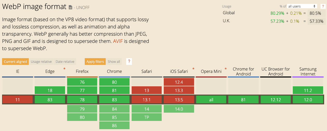
When will Safari support WebP?
In June 2020 at Apple's WWDC event, it was announced that Safari 14 (currently in beta), will support WebP images. Safari 14 will be released for both Mac and iOS later in the year, most likely September - based on major Safari updates released in recent years.
Browser support will increase driving wider adoption of this image format on the web.
Will IE11 support WebP?
IE11 is unlikely to support WebP. While this could be an issue depending on your analytics of browser usage for your website(s), I will explain later in the article how you can still serve WebP images with a fallback for older browsers such as IE11.
So, should you use WebP images instead of JPG and PNG?
Now is a great time to consider using WebP for your websites. WebP support will increase to 80-90% of users (on average globally) when Safari 14 is released later this year. Yes, a fallback will still be required, but the savings you'll make to make pages load faster will be worth the effort.
How to convert JPG and PNG to WebP?
Converting JPGs and PNGs to WebP can be done in several ways with varying levels of difficulty. I'll share several options that will suit designers, developers and content editors depending on how they source their images and add them to websites.
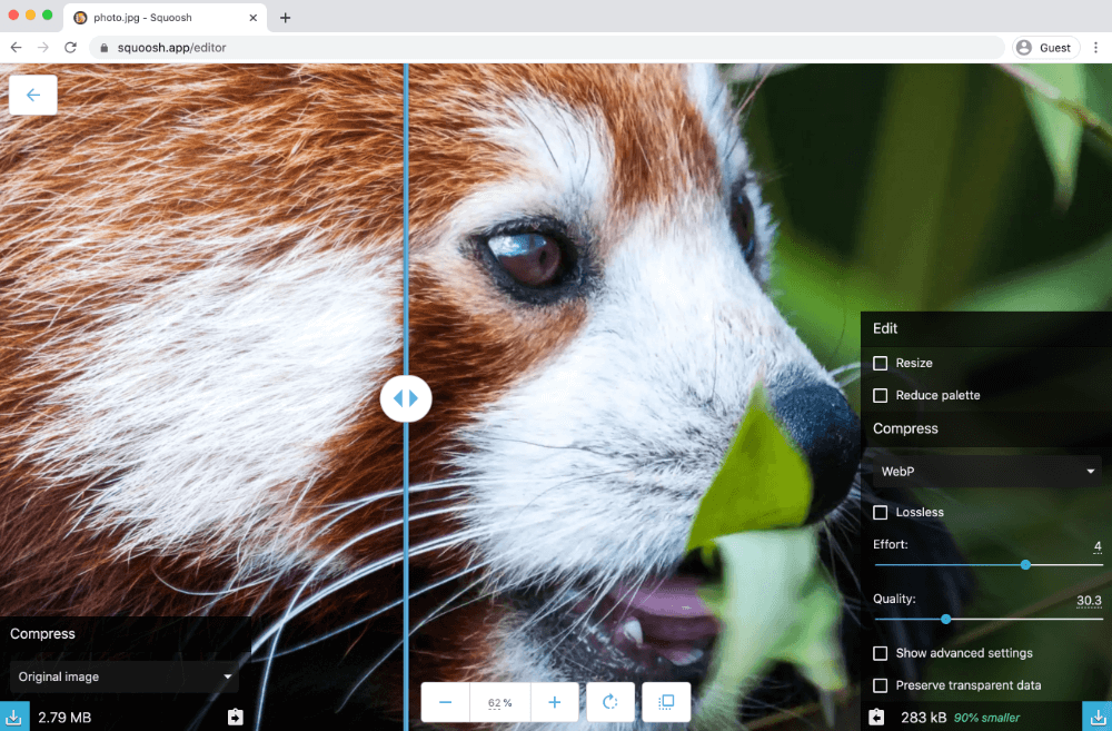
Convert online using Squoosh.app
Squoosh.app is a web app produced by Google. It's an easy and quick way to convert your PNG and JPG images to WebP (and many other image formats). There are several controls to tweak settings, including a small slider to adjust the quality and on the image preview itself a larger slider to compare quality with the original image.
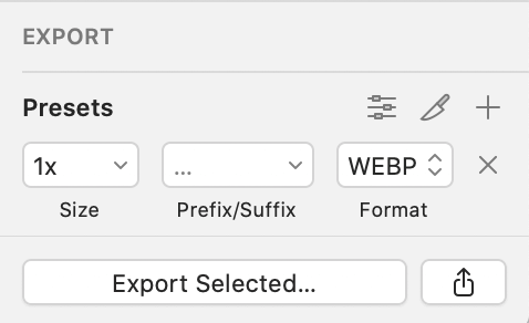
Using Sketch to convert to WebP
Sketch natively allows you to export an asset to WebP. To do this, select an asset on your design and in the Inspector panel on the right-hand side, open the 'Export' option.
Here you can change the format to WebP. Then you can hit the 'Export selected....' button.
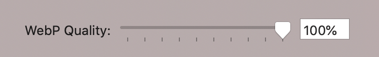
The file/folder 'Save as' dialogue window will appear, and you can adjust the WebP quality level. You will want to play with this depending on the image to determine the lowest quality level without any significant image deterioration.
Using Photoshop to convert to WebP
Unfortunately, Photoshop doesn't allow you to convert to WebP natively, but there are plugins to help do this. Download and install the Telegraphics WebP File Format plugin and next time you are using Photoshop, using 'Save As...' you then have the options for saving with WebP and WebP Lossless with various settings to tweak depending on your choice.
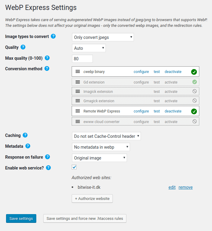
Using Wordpress to convert to WebP
Currently, Wordpress does not support the WebP image format natively. It is still possible to load WebP images on your Wordpress website via a Wordpress plugin called WebP Express.
Using the command line to convert to WebP
You can use cwebp to convert image files to WebP via the command line. You'll need to download and install the precomplied utilities from the Google WebP Documentation site. The basic command would be:
cwebp -q 80 image.png -o image.webpRead the documentation on cwebp to learn more.
Using other conversion methods
I can only cover a selection of conversion methods for the scope of this article. Depending on the operating system, content management system, build tools, or content delivery network (CDN) used, there are many options available to let you do this.
Using WebP in HTML
With the addition of WebP support in Safari browsers later this year, browser support will be high for WebP. Using WebP will be of benefit for the majority of users.
There will be a portion of users who won't be able to see WebP images in their browser (IE11 and older versions of browsers slow to update). We need to add the WebP image but with a fallback image (JPG/PNG) for when the browser doesn't support it.
The requirement for a fallback image means a standard <img> element is not good enough in this case as it only gives the option of 1 image src, with no fallback.
Loading WebP Images with the <picture> element
To allow a fallback image, we can use the <picture> element as below:
<!-- Adding a WebP image with a fallback image -->
<picture>
    <source srcset="/images/example-image.webp" type="image/webp">
    <source srcset="/images/example-image.jpg" type="image/jpeg">
    <img src="/images/example-image.jpg">
</picture>
It will attempt to load the WebP image if the browser supports it. If not, it will fall back to second <source> element to load the JPG (or PNG). In the rare case the user has a old browser which doesn't even support the <picture> element it will fallback to the <img> element, loading the JPG (or PNG) instead.
Using WebP in CSS Backgrounds
Loading WebP background images via CSS involves more effort to set up (to ensure a fallback image when not supported), but don't let this discourage you. The time you spend to set this up will be worth the benefit of having a faster website. Let's go over how to set this up.
With CSS, we would normally load a background image in like below:
/* Adding a WebP image in CSS - if no fallback considered */
 .hero-container {
    background-image: url('/images/example-image.webp');
}
Now because not all browsers support WebP, this line of code would load no background image for this element in those affected browsers. We need a way to choose between 2 different images via CSS, for example, a WebP image or a JPG image.
We can do this by detecting if the browser supports WebP. If it does we load the WebP background image, if not, we can load the fallback image - in this example, a JPG image.
To help us do this, we need to set classes on the root <html> element. These classes will match a specific CSS rule to load the correct image based on browser support.
The two classes we'll use to help us do this are:
.no-webp
AND
.web-p
We'll only add one of these classes to the code, we'll cover how we add this into the code in a moment, firstly, lets set up the two different CSS rules we need:
/* No WebP support - load the png/jpg image - the fallback */
.no-webp .hero-container {
    background-image: url('/images/example-image.jpg');
}
/* WebP supported - load the faster WebP image instead */
.web-p .hero-container {
background-image: url('/images/example-image.webp');
}So to match one of these rules we will detect if the browser supports WebP, and from this, we decide which of the two 'root' classes (.no-webp or .webp) are dynamically added to the <html> element using javascript.
Detect if the browser supports WebP
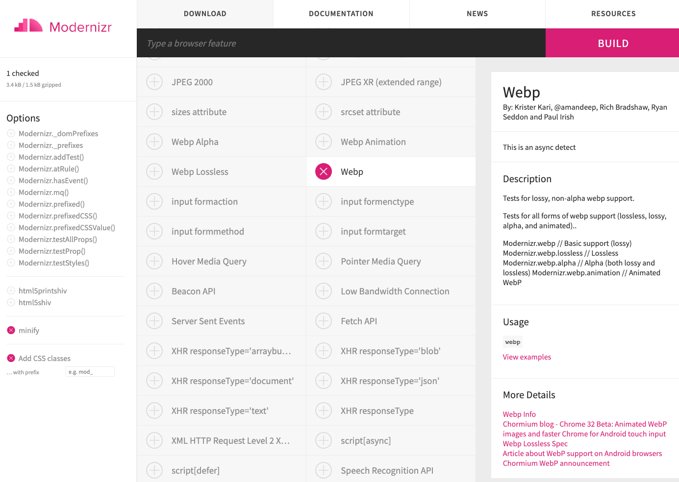
Modernizr is a javascript library which detects HTML5 and CSS3 features in the user's browser. It can be useful if you need to consider using fallbacks if you need to support older browsers.
It is crucial if using javascript libraries only to use the features you need. Rather than loading in the full library which could be a large file, there is generally an option to selectively choose the features you require which results in a much smaller lightweight file. Remember, we are trying to speed up our website so the less we need to download to load the page, the better. Modernizr allows you to selectively choose the features you need.
For this example, you'll just need the 'Webp' feature.
When you add the script for the modernizr JS file to your HTML, you want it high up in your <head> section, so it has the chance to detect WebP support as soon as possible. This way, the correct background image can then be loaded.
I'm well aware this approach is dependent on javascript. While the web today is heavily reliant on javascript. A small number of users will have javascript disabled, and many websites will contain javascript errors which could affect the page from loading correctly.
So how do we cover occasions when javascript is disabled or not loaded for some reason?
When using modernizr, by default on the <html> element, we should add a no-js class directly in the code.
<!-- Adding the default no-js class to the HTML element -->
<html lang="en" class="no-js">
If javascript is present, modernizr will swap this out to js and also add the additional classes required, in this case, either web-p or no-webp.
Below is what the modernizr script does with the class attribute on the <html> element. In Chrome, which supports WebP (and its supporting WebP features), it dynamically updates to the below:
<!-- When Modernizr WebP script is added - CHROME (supports WebP) -->
<html lang="en" class="js webp webp-alpha webp-animation webp-lossless">
But if using a browser that doesn't support WebP, such as Safari 13, the code is dynamically updated to:
<!-- When Modernizr WebP script is added - SAFARI 13 (DOES NOT support WebP) -->
<html lang="en" class="js no-webp">
This is how we can target different classes via the CSS (referenced above) to load different CSS backgrounds.
If javascript is disabled (or there is a javascript error causing issues on the page), the hardcoded no-js class won't be dynamically changed. In this scenario, you can use this CSS rule below to continue to load the JPG/PNG instead:
/* No JS No Modernizr - load the png/jpg image */
.no-js .hero-container {
    background-image: url('/images/example-image.jpg');
}
One thing I'd recommend when adding this final .no-js CSS rule is to hold it in a separate CSS file to the rest of the CSS. Load this CSS file from within a <noscript> tag in the head as we only want this CSS (and the image) to be requested/loaded if javascript is disabled.
Conclusion
The WebP image format has better compression and optimization techniques than available with JPG and PNG formats. While fallbacks are still required for some older browsers, the benefit of switching to use WebP for the majority of your users will help page loads on your website which has the potential to decrease bounce rate, increase conversion, save money and even the environment.
Large companies like Amazon and Netflix have moved to use WebP images alongside Google sites such as YouTube. Apple have decided 10 years after WebP was created that it is finally time to add it to its Safari browser for Mac and iOS later in 2020 - WebP isn't going anywhere. It is something you should consider to help improve your page speed scores which are becoming a stronger search ranking factor.
While switching to WebP images on existing large websites could involve significant work, there are ways to quickly serve WebP images with options on CDN services and specialist image CDNs. Content management systems such as WordPress have plugins available to help make the switch easier. Each situation will be different but there is no doubt, faster websites perform better. Image optimisation tends to be low hanging fruit in the quest for reducing page weights.
Will you be using the WebP image format?
Written by:

Terry O'Brien
Helping businesses create accessible, mobile friendly, fast websites. If I can help you, get in touch for a chat.